7 Common Decor Mistakes That Make Homes Look Cheap
May 18, 2026 · Ali Hassan salman
Upgrade your home with modern decor tips that instantly elevate your space. Avoid common mistakes like poor lighting, small rugs, and mismatched storage. Discover luxury home styling ideas, minimalist interiors, and smart organization hacks for a cohesive, high-end look on a budget.
Your home should feel like a stylish, not a discount showroom. Even with good intentions and a tight budget, certain decor mistakes can make your space look cheap and uninviting.
This guide is for homeowners and renters who want to elevate their space without breaking the bank. We'll show you how small changes can make a big difference in your home's overall appeal.
You'll discover how poor lighting choices can instantly drain the warmth from any room and why furniture arrangement mistakes leave your space feeling awkward and unbalanced. We'll also cover color and pattern blunders that create visual chaos instead of the cohesive look you're after.
Ready to transform your home from bargain-basement to beautifully designed? Let's fix these common decorating mistakes that are holding your space back.
Poor Lighting Choices That Instantly Cheapen Your Space
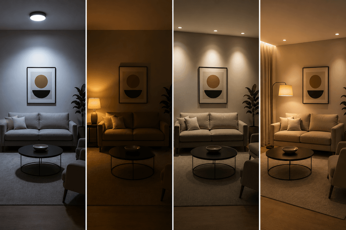
Lighting Choices in room
Relying Solely on Overhead Ceiling Fixtures
Walking into a room lit only by a harsh overhead light feels like stepping into an interrogation room. This single-source lighting creates unflattering shadows and eliminates any sense of warmth or ambiance. Your beautiful living space suddenly looks flat and institutional, no matter how expensive your furniture might be.
Most builders install basic ceiling fixtures as the primary light source, but these should never be your only option. Overhead lighting casts downward shadows that make people look tired and rooms feel cold. The stark illumination also highlights every imperfection in your space while creating a sterile atmosphere that screams "budget decorating."
Using Mismatched Light Bulb Colors Throughout the Home
Nothing makes a home feel more disjointed than walking from a warm yellow-lit kitchen into a cool blue-white living room. Different color temperatures create visual confusion and make your carefully chosen paint colors look completely off.
Warm lights (2700K-3000K) make spaces feel cozy but can muddy certain colors, while cool lights (4000K+) feel energizing but can appear harsh in relaxation areas. The key is consistency within connected spaces and choosing the right temperature for each room's purpose.
Installing Cheap-Looking Light Fixtures
Builder-grade fixtures with shiny brass finishes or basic glass shades immediately signal "budget home." These mass-produced pieces lack personality and often use poor-quality materials that look dated within months of installation.
Forgetting to Layer Different Types of Lighting
Professional designers always use three types of lighting: ambient (general room lighting), task (focused work lighting), and accent (decorative highlighting). Skipping this layering approach leaves rooms feeling incomplete and poorly designed.
Without proper layering, you can't adjust the mood for different activities. Reading becomes difficult, entertaining feels awkward, and your beautiful decor remains hidden in shadows.
Solution: Creating a Well-Lit, Expensive-Looking Home
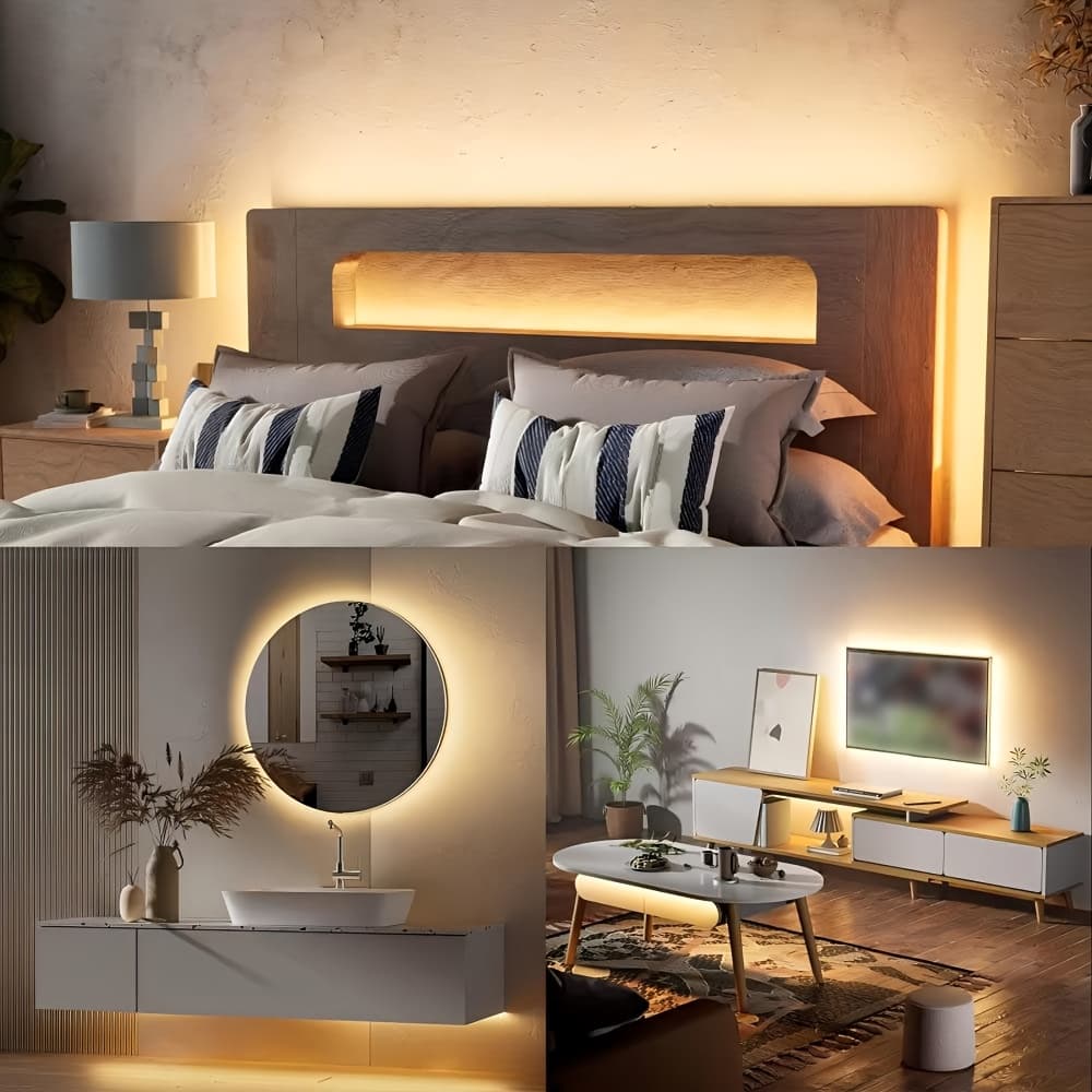
Under-cabinet LED strips for task lighting
Start with a lighting plan that includes:
Table lamps and floor lamps for ambient lighting Under-cabinet LED strips for task lighting Picture lights or track lighting for accents Dimmer switches on all fixtures
Choose fixtures in consistent finishes like matte black, brushed nickel, or warm brass throughout connected spaces. Invest in LED bulbs with consistent color temperatures - 2700K for bedrooms and living areas, 3000K for kitchens and bathrooms.
Remember that good lighting doesn't require expensive fixtures - it requires thoughtful placement and layering. A few well-chosen lamps can transform your space more dramatically than one expensive chandelier.
Furniture Arrangement Mistakes That Make Rooms Feel Off-Balance
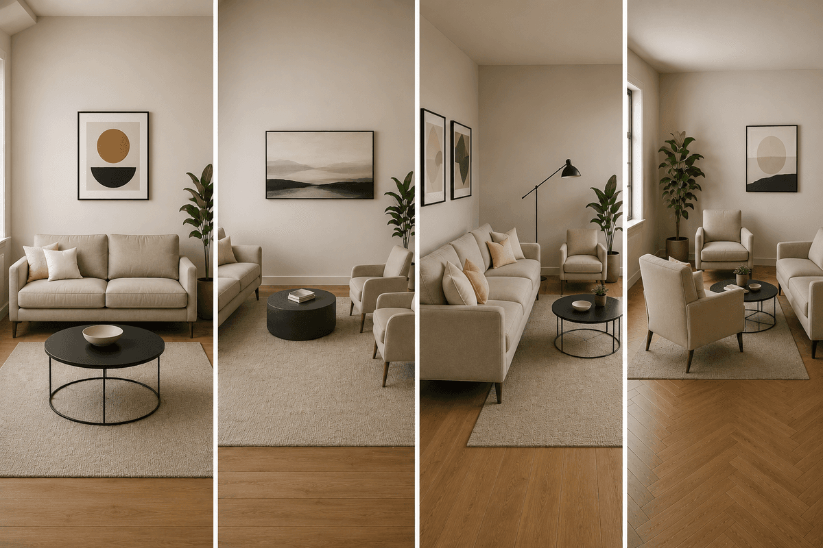
Furniture Arrangement in room
Pushing All Furniture Against the Walls
This decorating habit screams amateur and instantly makes your space look smaller and less inviting. When you line every piece against the perimeter, you create a bowling alley effect that feels cold and disconnected. Your living room becomes a place where conversation dies because people are sitting too far apart to comfortably chat.
Floating your sofa away from the wall by just 12-18 inches creates breathing room and makes the space feel larger. Try positioning your couch to face a focal point like a fireplace or TV, with accent chairs angled slightly toward it. This arrangement naturally encourages conversation and creates a cozy gathering spot.
For smaller rooms, pull your furniture just a few inches from the walls. Even this small adjustment creates visual depth and prevents that cramped, pushed-against-the-wall look that makes spaces feel cheap.
Choosing Furniture That's Wrong Scale for the Room
Scale mistakes are room killers that make even expensive furniture look budget. A massive sectional in a tiny apartment overwhelms the space, while petite furniture in a large room looks lost and insignificant.
Your coffee table should be about two-thirds the length of your sofa and sit 14-18 inches away from it. Side tables should be within easy reach of seating – roughly the same height as your sofa arm. When everything is proportioned correctly, your room feels balanced and intentional.
Oversized furniture isn't just a space issue; it blocks natural light and makes rooms feel claustrophobic.
Ignoring Traffic Flow and Functionality
Bad traffic flow creates frustration every single day and makes your home feel dysfunctional. When people have to squeeze between furniture or walk around major obstacles to get from room to room, your layout is working against you.
Plan your main pathways first, then arrange furniture around them. You need at least 36 inches of walking space for major traffic areas and 18-24 inches for secondary paths. Your furniture should guide movement naturally, not create roadblocks.
Think about how you actually use each space. Don't block access to frequently used items like bookshelves or storage. Position reading chairs near good lighting and make sure there's a spot to set down drinks or books nearby.
Solutions for Better Furniture Arrangement
Start with a floor plan before moving heavy pieces around. Measure your room and furniture, then sketch different arrangements or use free online room planning tools to test layouts digitally.
Create conversation areas by grouping furniture in intimate clusters. Use area rugs to define these zones and make sure all furniture legs either sit completely on or completely off the rug – never partially on.
Instead of pushing everything against walls, try the "floating island" approach with a Modul
ar Sectional Sofa System that can be reconfigured as needed. These versatile pieces let you experiment with different arrangements without committing to one layout forever.
For better scale, consider a Nesting Coffee Table Set that provides multiple surface options without overwhelming smaller spaces. When you need extra table space for entertaining, pull out the smaller tables; when you want more floor space, nest them back together.
Improve traffic flow with Multi-Functional Storage Ottomans that provide seating, storage, and surface space while being easy to move around as needed. These versatile pieces solve multiple layout challenges while maintaining clean lines and visual appeal.
Color and Pattern Blunders That Create Visual Chaos
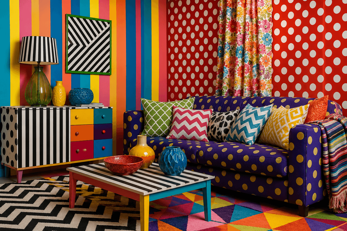
Color and Pattern Blunders in room
Using Too Many Bold Colors Without a Cohesive Palette
Walking into a room that feels like a rainbow explosion instantly screams amateur design. When homeowners get excited about multiple vibrant colors without considering how they work together, the result looks chaotic and cheap. Your living space ends up feeling like a children's playroom rather than a sophisticated home.
The key is sticking to a maximum of three main colors in any room. Choose one dominant neutral, one secondary color for larger elements, and one accent color for small decorative pieces.
Alternative product: Instead of random colorful accessories, invest in a curated color palette kit or hire a color consultation service that can create a professional scheme for your space.
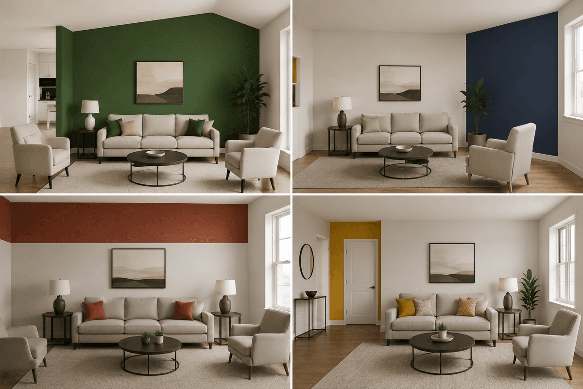
Painting Accent Walls in Random Locations
Painting Accent Walls
Not every room needs an accent wall, and choosing the wrong wall can make your space look unbalanced. Many homeowners paint the first wall they see or pick one randomly, which often highlights awkward architectural features or creates odd proportions.
The best accent wall is typically the one your eye naturally lands on when entering the room - usually the wall behind the bed, sofa, or fireplace.
Alternative product: Instead of bold paint, consider removable wallpaper or peel-and-stick panels that allow you to experiment without permanent commitment.
Choosing Paint Colors Based on Trends Rather Than Room Function
Painting your dining room millennial pink just because it's trendy ignores how the space actually functions. Colors affect mood and appetite, so trendy choices might work against your room's purpose. Bright orange might be having a moment, but it won't help you relax in your bedroom.
Consider how you use each space before picking colors. Bedrooms benefit from calming blues or soft neutrals, while kitchens can handle more energizing colors.
Use color-changing smart bulbs or quality lampshades to experiment with different color temperatures instead of committing to trendy wall colors that you'll regret next year.
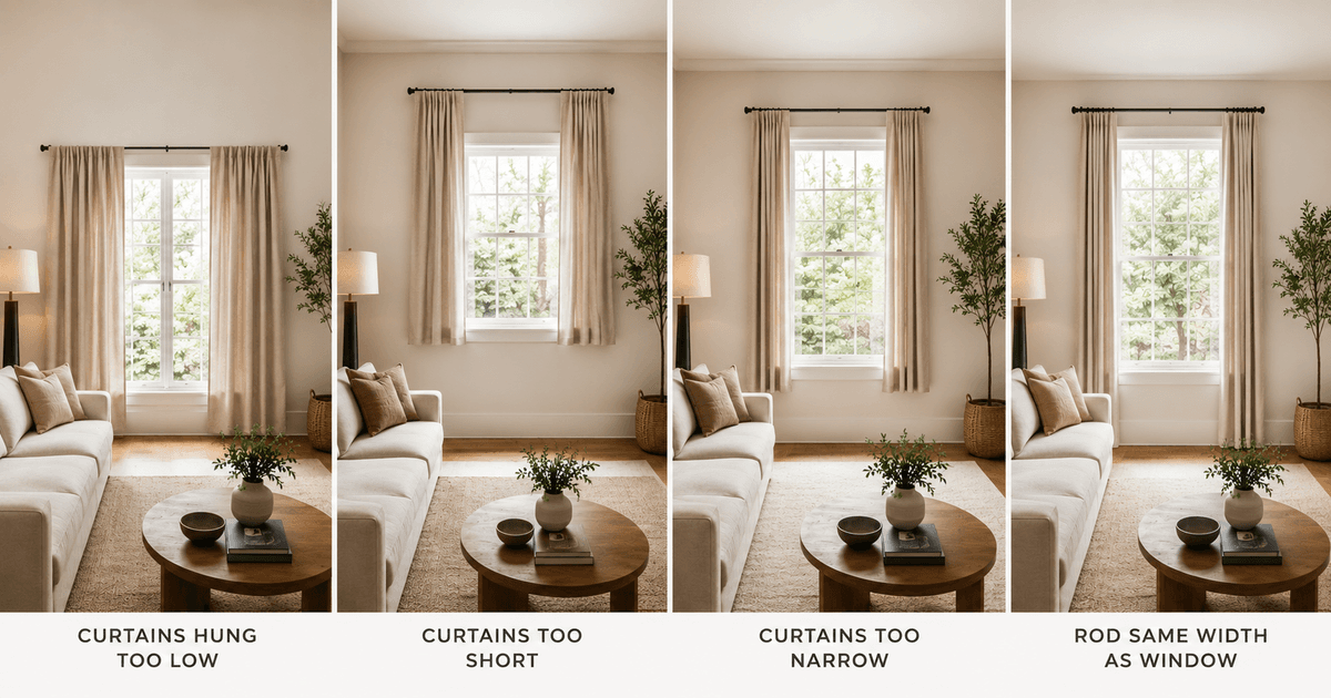
Hanging Curtains at the Wrong Height
Hanging Curtains at the Different Height
The most common window treatment mistake homeowners make is hanging curtains too low. When you mount curtains just above the window frame, you create the illusion that your ceilings are shorter than they actually are. This instantly makes any room feel cramped and less sophisticated. Professional designers always hang curtains close to the ceiling, typically 4-6 inches below the crown molding or ceiling line. This simple trick draws the eye upward and creates the appearance of taller windows and higher ceilings.
Another height error involves hanging curtains so high that they look disconnected from the window itself. While you want to create visual height, the curtains should still have a clear relationship with the actual window opening.
Selecting Curtains That Are Too Short or Narrow
Nothing screams "budget decor" quite like curtains that don't fit properly. Short curtains that hover awkwardly above the floor or hit at random points like mid-calf make windows look like they're wearing ill-fitting clothes. The ideal length depends on your style preference: curtains should either just kiss the floor, have a subtle puddle of 1-2 inches, or stop precisely at the windowsill for a clean, tailored look.
Width is equally important. Skimpy panels that barely cover the window when closed create a pinched, inadequate appearance. Your curtains should be 1.5 to 3 times the width of your window for proper fullness. When open, panels should extend beyond the window frame on both sides, allowing maximum light while maintaining an elegant drape.
The Professional Solution
Transform your windows by implementing the "designer formula":
Hang wide curtains high and choose quality hardware. Mount brackets close to the ceiling, select panels that are generously sized, and invest in sturdy, attractive rods. This combination creates the illusion of larger windows, taller ceilings, and more expensive decor - all without breaking your budget.
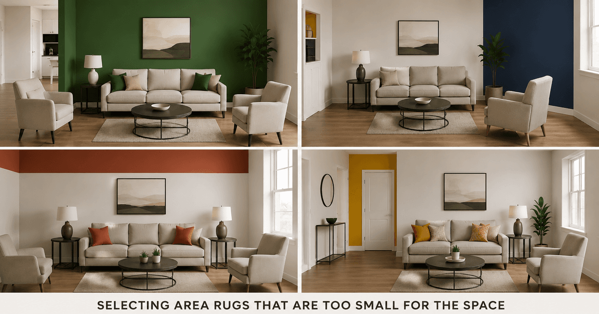
Selecting Area Rugs That Are Too Small for the Space
Area Rugs That Are Too Small for the Space
Walking into a room with a tiny rug floating in the middle of a large space feels like seeing a postage stamp on a billboard. This common mistake happens when homeowners choose rugs based on budget rather than proper sizing, creating an awkward visual disconnect that makes the entire room look unfinished and cheap.
The golden rule for rug sizing requires at least the front legs of your furniture to rest on the rug. In living rooms, this means selecting rugs that are large enough to anchor your seating area properly. A 5x8 rug might seem adequate for a standard living room, but it often falls short, leaving furniture legs stranded on bare floor and creating visual fragmentation.
Dining rooms demand even more precision. Your rug should extend at least 24 inches beyond your table on all sides, allowing chairs to remain on the rug even when pulled out. Skimping on size here creates an uncomfortable dining experience and makes the room feel cramped and poorly planned.
Common Size Mistakes:
Using 5x8 rugs in large living rooms Choosing 6x9 rugs for standard dining tables Placing small accent rugs in spacious bedrooms Selecting runners that are too short for hallways
Using Mismatched Flooring Materials in Open Floor Plans
Open floor plans demand visual continuity, yet many homeowners create jarring transitions by mixing multiple flooring materials without proper planning. The result looks disjointed and screams "DIY disaster" rather than sophisticated design.
The biggest culprit is abrupt material changes at arbitrary points. Picture walking from beautiful hardwood floors directly onto cheap laminate or switching from tile to carpet mid-room. These harsh transitions break the visual flow and make spaces feel choppy and uncoordinated.
Smart flooring transitions require intentional boundaries. Natural break points like doorways, level changes, or functional zones work well for material switches. When you must mix materials, use transition strips that complement both surfaces or create intentional borders that look purposeful rather than accidental.
Successful Transition Strategies:
Use thresholds at doorways for material changes
Match undertones when combining wood and tile
Create intentional borders with decorative strips
Maintain consistent color temperatures across materials
Neglecting Proper Rug Placement Under Furniture
Even the right-sized rug can look terrible when placed incorrectly. Many homeowners treat rugs like afterthoughts, sliding them under furniture without considering proper proportions or visual balance.
The "floating furniture" approach ranks among the worst offenses. This happens when all furniture legs sit completely off the rug, creating an island effect that makes the room feel disconnected. Your seating area should feel anchored and unified, not like furniture randomly scattered around a decorative floor covering.
Bedrooms require special attention to rug placement. The rug should extend far enough beyond the bed to provide a soft landing for your feet. A rug that stops short of the nightstands or barely peeks out from under the bed frame looks stingy and poorly planned.
Proper Placement Guidelines:
Front furniture legs on the rug, back legs off (minimum)
All furniture legs on the rug (ideal for smaller spaces)
Rugs extending 18-24 inches beyond bed frames
Coffee tables centered with equal spacing to seating
Solutions for Stylish Flooring and Rug Choices
Creating sophisticated flooring and rug combinations requires understanding scale, proportion, and visual flow. Start by measuring your spaces properly and investing in appropriately sized rugs rather than settling for undersized options that compromise your room's potential.
For open floor plans, develop a cohesive flooring strategy before installation begins. Choose materials that complement each other, and plan transitions at logical points. Consider hiring professionals for complex layouts to ensure seamless execution.
Smart Shopping Tips:
Measure twice, buy once - bring room dimensions when rug shopping
Consider rug pads to prevent sliding and extend rug life
Choose quality materials that photograph well and wear beautifully
Plan flooring materials during the design phase, not as afterthoughts
Transform your space by treating floors and rugs as foundational design elements rather than decorative afterthoughts. Proper sizing, placement, and material coordination create the sophisticated foundation your home deserves.
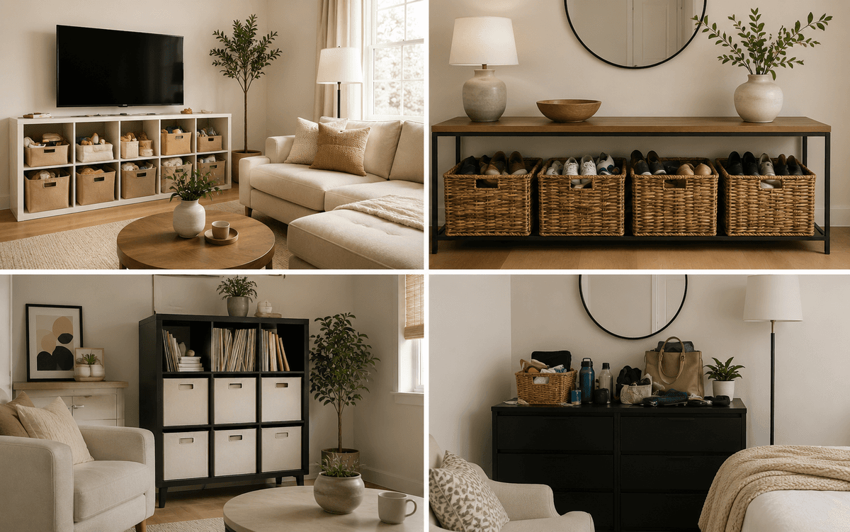
Storage Solutions That Compromise Your Home's Aesthetic Appeal
Storage Cabinet Ideas for room
Leaving Clutter Visible in High-Traffic Areas
Nothing makes a beautiful home look instantly messy like leaving everyday items scattered across countertops, coffee tables, and entryways. keys, chargers, and random household items create visual noise that distracts from your carefully chosen decor.
Quick fixes:
Install wall-mounted mail organizers with slots for bills, a keys organizer
Use decorative trays on coffee tables to corral remotes and small items
Add a stylish entryway console with hidden drawers for storing daily clutter
Using Mismatched Storage Containers and Organizers
Randomly collected containers in different colors, materials, and styles create a chaotic pantry or closet appearance. Plastic food containers from various brands, old shoeboxes, and random baskets make even organized spaces look disjointed.
Better approach:
Choose storage containers in matching materials (all glass, all bamboo, or all white plastic)
Invest in a complete storage system rather than piecing together random items
Label containers with consistent fonts and label styles
Failing to Conceal Everyday Items in Living Spaces
Leaving phone chargers, remote controls, magazines, and personal items visible on surfaces makes living rooms feel cluttered rather than curated. Even expensive furniture loses its impact when surrounded by daily necessities.
Smart concealment strategies:
Use coffee tables with built-in storage drawers
Install floating shelves with hidden cable management
Choose side tables with enclosed storage compartments
Choosing Storage Furniture That Doesn't Match Your Decor Style
Mismatched storage pieces—like a modern plastic organizer in a farmhouse kitchen or industrial metal shelving in a coastal bedroom—create style confusion and cheapen the overall aesthetic.
Style-matching tips:
Select storage furniture that complements your existing pieces in material and finish
Choose pieces that serve dual purposes (a storage ottoman that matches your sofa)
Consider built-in looking storage solutions that blend seamlessly
Solutions for Stylish Storage
Create cohesive, attractive storage by treating organization as part of your decor strategy rather than an afterthought. Invest in pieces that enhance your aesthetic while providing necessary function, and always prioritize quality over quantity when selecting storage solutions.
Conclusion
Avoiding these seven decorating pitfalls can transform your home from looking budget-conscious to beautifully curated. Smart lighting placement, balanced furniture arrangements, and thoughtful color choices work together to create spaces that feel intentional and polished. Simple swaps like proper window treatments and well-placed rugs make a huge difference without breaking the bank.
Start by tackling just one area at a time – maybe upgrade those overhead lights or rearrange your furniture for better flow. Small changes add up quickly, and you'll be amazed at how much more expensive and put-together your home can look with these easy fixes.