17 Living Room Color Ideas and Color Palettes to Transform Your Home
July 06, 2026 · Lilac Pearls
Discover 17 stunning living room color palette ideas, from neutral living room color palettes to bold living room color schemes. Find the best living room paint colors for your home.
Have you ever walked into a living room that immediately made you feel warm, inviting, and comfortable? The reason isn’t expensive furniture; it’s the color palette. The right living room color palette can influence the mood of a room, make a space feel larger or cozier, and bring all of your decor together. If you are planning a complete makeover or simply trying to refresh your existing space, one of the most important design decisions you will make is choosing the right living room color scheme. In this guide, you’ll discover 17 beautiful living room color ideas and tips to help you create a home that feels calm, cozy, and personal. Whether you’re searching for small living room color ideas or a bold statement palette, there’s an option here for every style.
This post contains affiliate links. If you purchase through one of these links, we may earn a small commission at no extra cost to you. Thank you for supporting our blog!
How to Choose the Right Living Room Color Palette
Consider Natural Light
Natural light is an important factor to consider when choosing your living room color palette. Rooms with plenty of sunlight can handle both darker and cooler shades, while rooms with limited natural light often look brighter and more inviting with light, warm colors such as cream, beige, or soft white.
Room Size Matters
When choosing the right color combination, considering room size is crucial. Light colors can make a small room feel larger and more open, while darker colors add warmth and depth to spacious living rooms. For a balanced and comfortable space, choose a color scheme that suits your room size. These small living room color ideas are especially helpful if you’re working with a compact space.
Match Existing Furniture
Your existing furniture should guide your color palette. You should choose wall colors that complement your sofa, rugs, and other large furniture pieces to create a cohesive and balanced look. This will make your room look stylish and well-coordinated.
Choose a Design Style
Choose a color palette that matches your design style. Whether your living room is modern, farmhouse, Scandinavian, coastal, or traditional, the right colors will create a cohesive and visually appealing space.
17 Living Room Color Ideas
Neutral Color Palettes
These neutral living room color palette ideas are perfect for anyone who wants a soft, timeless base that never goes out of style.
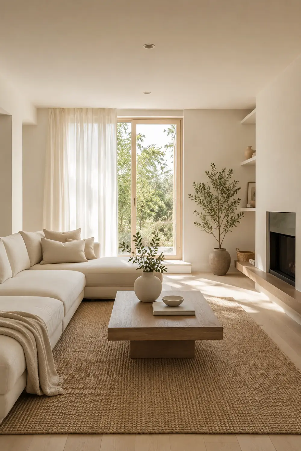
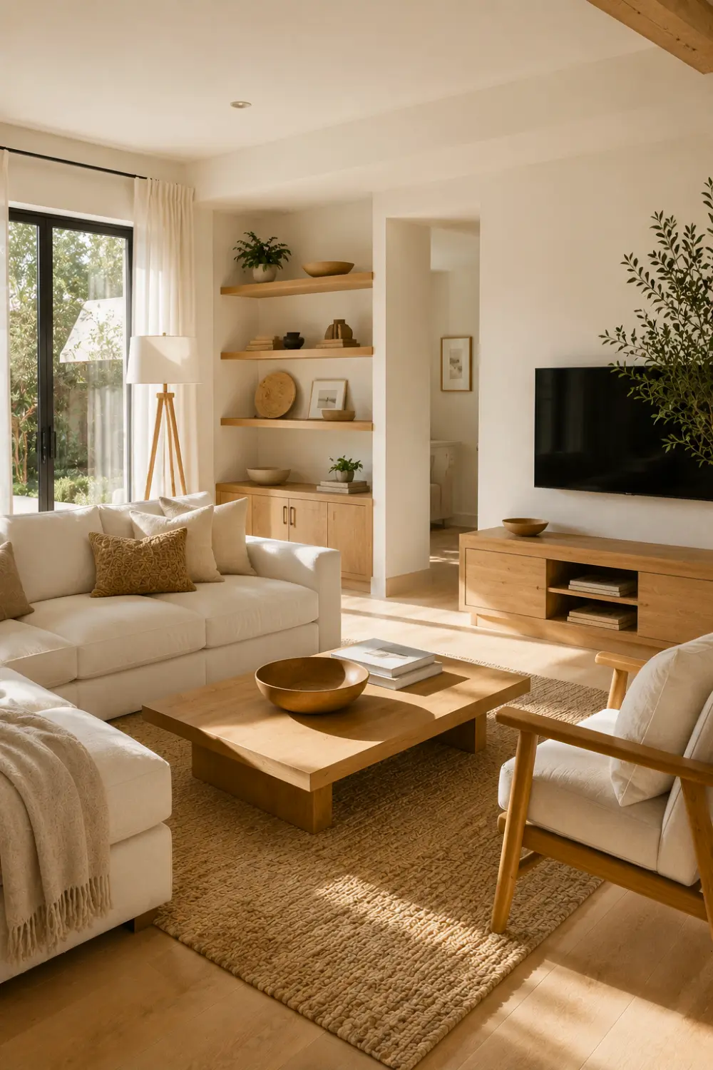
1. Beige & White
minimalist beige white living room color palette
Why This Palette Works
Beige and white bring a soft, understated calm into the living room — like a deep breath after a long day. This palette feels effortless yet warm, the kind of space that never overwhelms but always welcomes you home.
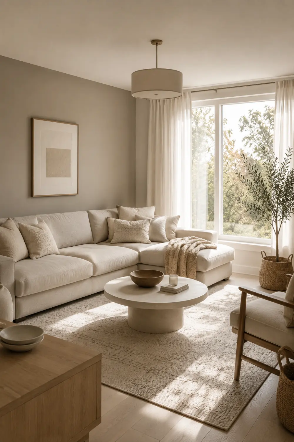
Greige and cream bring a soft, quiet balance into the living room — like the calm middle ground between warmth and cool restraint. Greige carries a subtle, sophisticated versatility, while cream adds a gentle glow that keeps the space feeling soft. Together, they create a room that feels effortlessly put-together, the kind of space that quietly comforts without trying too hard.
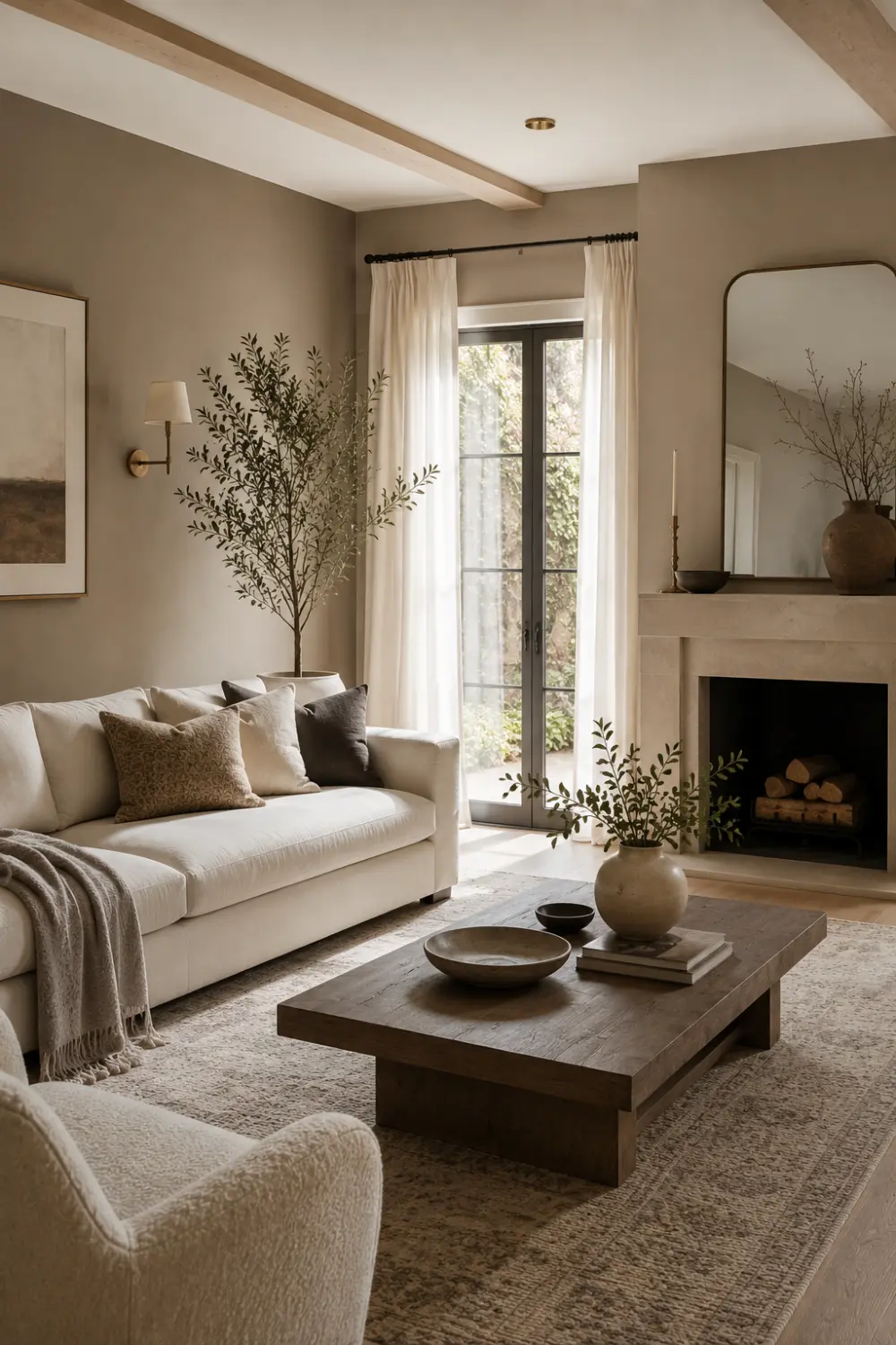
Taupe and ivory bring a warm, quiet elegance into the living room — like sunlight filtering softly through linen curtains. Taupe grounds the space with gentle depth, while ivory keeps things light and airy, creating a room that feels balanced, calm, and endlessly welcoming.
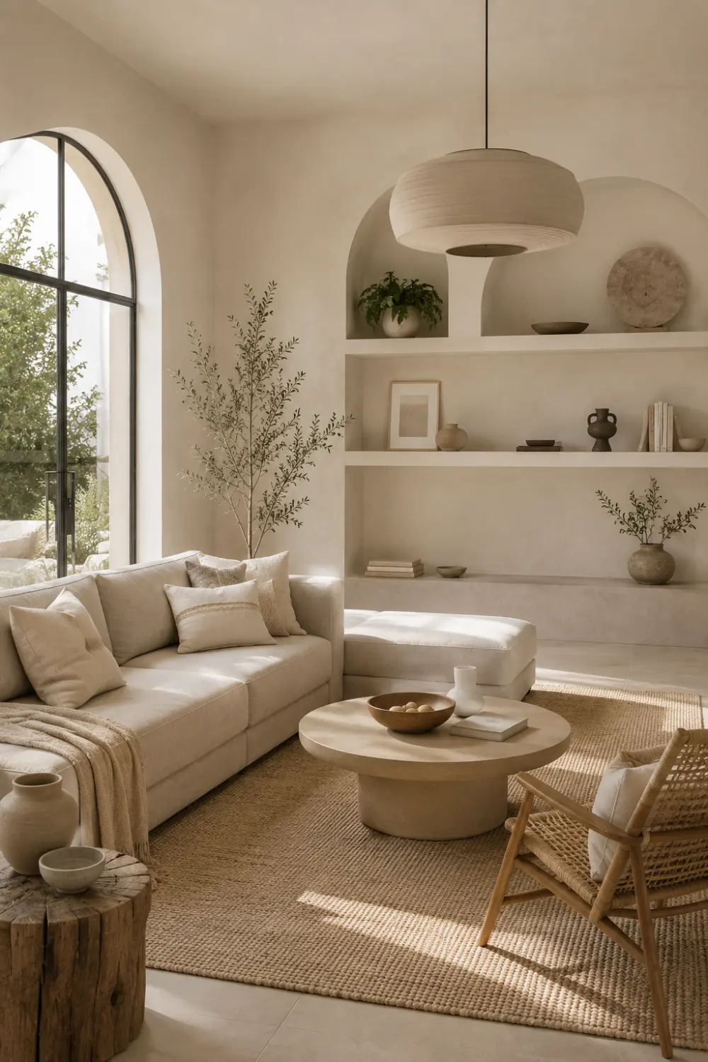
Sand and linen bring the calm of a sun-warmed beach house into everyday living. Sand adds a soft, earthy warmth, while linen keeps things light, airy, and effortless — this kind of color palette make a room that feels relaxed, natural, and quietly inviting.
Warm white and natural wood bring the feeling of a sun-filled cabin into your living room. Warm white wraps the space in a soft, gentle glow, while natural wood adds that comforting, grounded warmth — like the wood grain still remembers the tree it came from. Together, they create a space that feels honest and unhurried.
Lovers of cozy, cabin-inspired homes
Minimalists craving warmth, not starkness
Nature lovers who love organic textures
Families wanting a calm, inviting space
Shop This Look
Complete the cabin-inspired feel with a solid wood console table, a warm white boucle accent chair, a natural wood-framed mirror, and a set of linen storage baskets.
Modern Color Palettes
If you’re after a modern living room color palette with more contrast and depth, these combinations bring a fresh, updated feel.
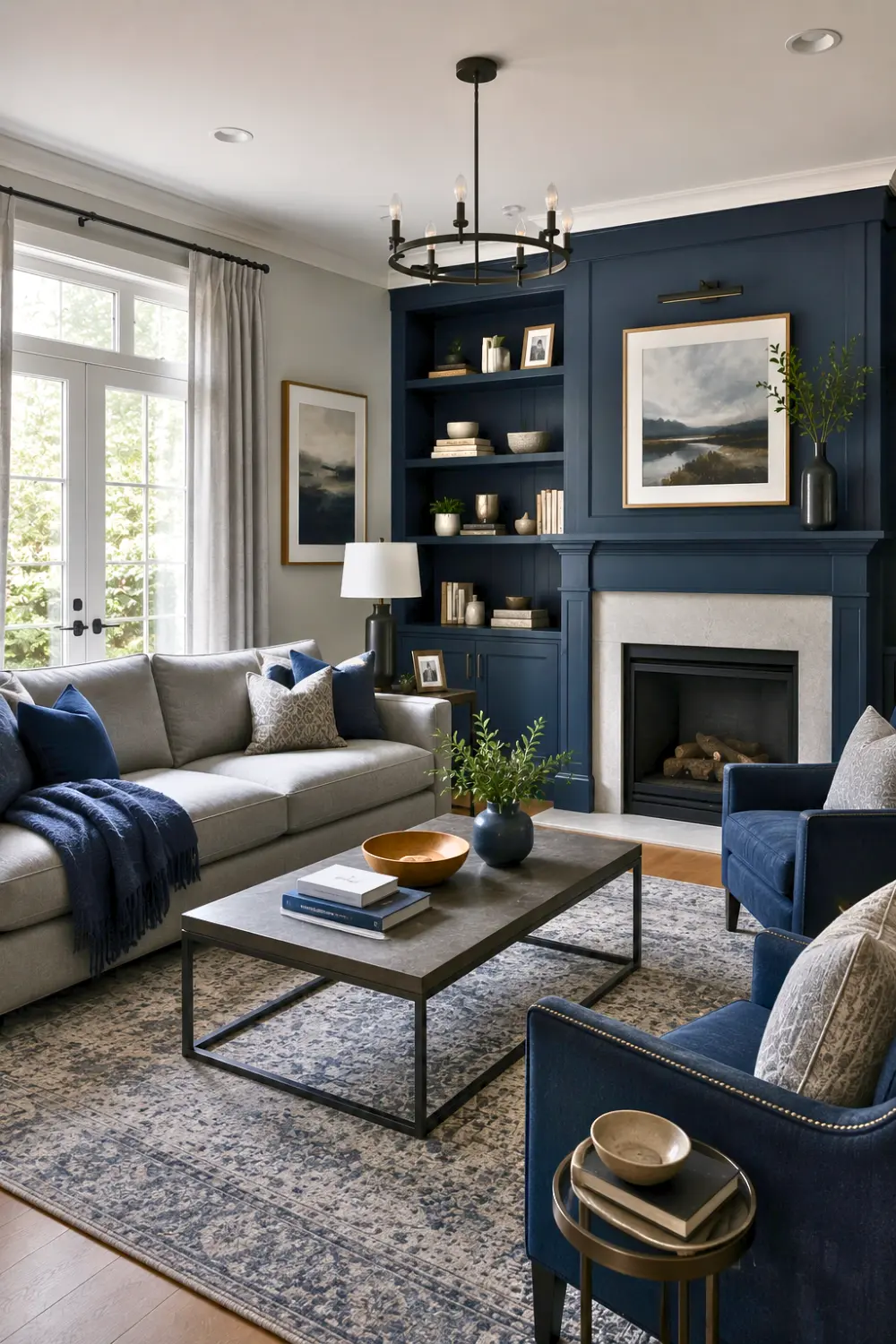
6. Navy Blue & Gray
navy blue gray living room color palette (2)
Why This Palette Works
Navy blue and gray bring a calm, grounded confidence into the living room. Navy adds deep, moody richness — while gray keeps things balanced and soft, never cold. Together, they create a room that feels strong yet soothing, this create a space where you can think clearly and feel safe.
This palette is for those who:
Crave calm, quiet, grounded spaces
Love timeless style over fleeting trends
Feel at peace in moody, cozy tones
Want a home that feels safe
Shop This Look
Style the space with a navy velvet accent chair, charcoal gray throw pillow covers, a brass floor lamp, and a soft gray wool area rug for grounded, modern warmth.
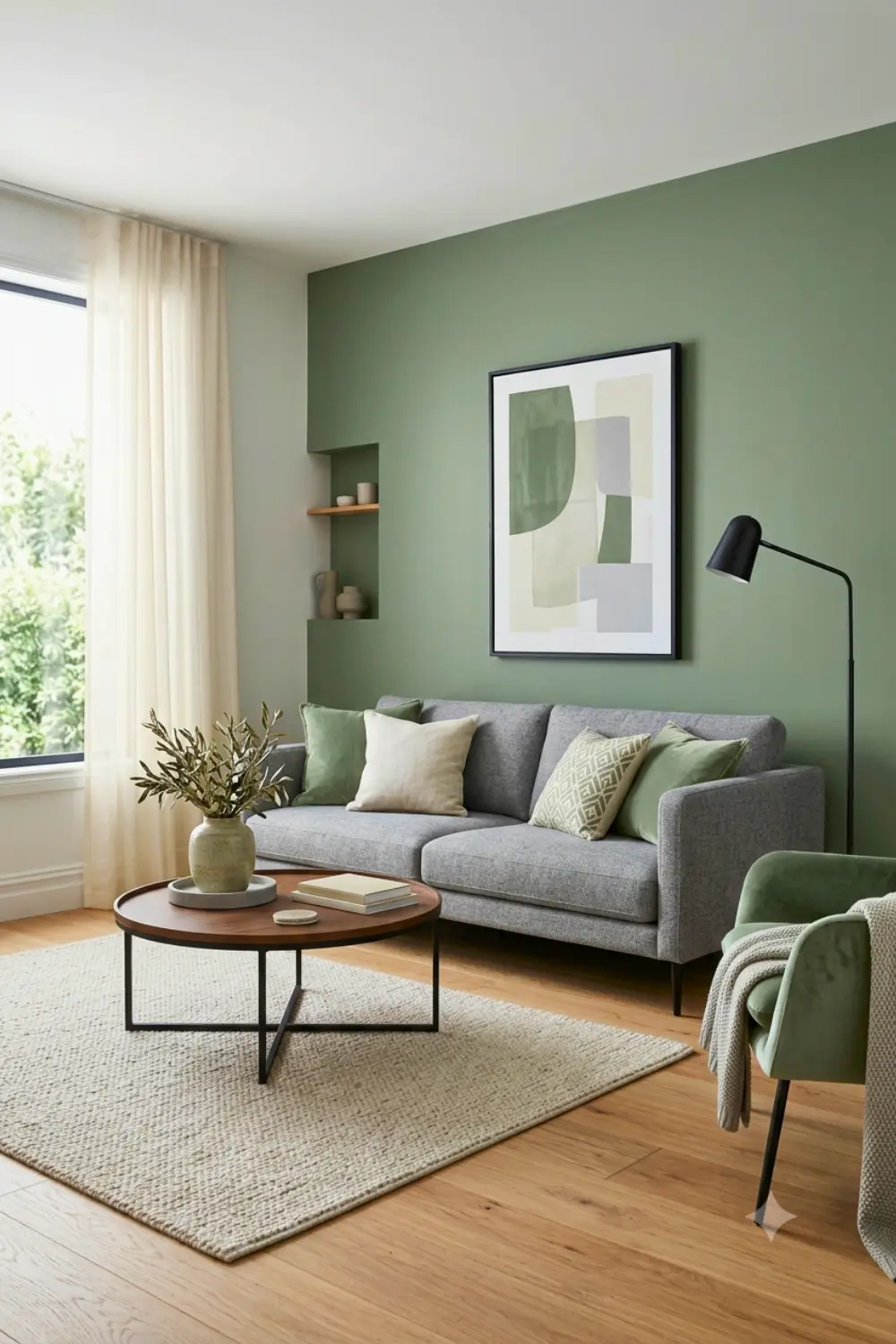
7. Sage Green & Cream
sage green cream living room color palette
Why This Palette Works
Sage green and cream bring the calm of a quiet garden indoors. Sage feels soft and earthy, like new leaves after rain, while cream adds a gentle warmth that keeps the room feeling light and comforting. Both these make your space gentle and peaceful.
This palette is for those who:
Find peace in nature’s soft colors
Love a calm, refreshing living space
Want warmth without heavy, dark tones
Cherish quiet mornings and slow living
Shop This Look
Bring in a sage green boucle sofa throw, cream linen curtain panels, a rattan plant stand, and a set of ceramic planters to complete the fresh, garden-inspired look.
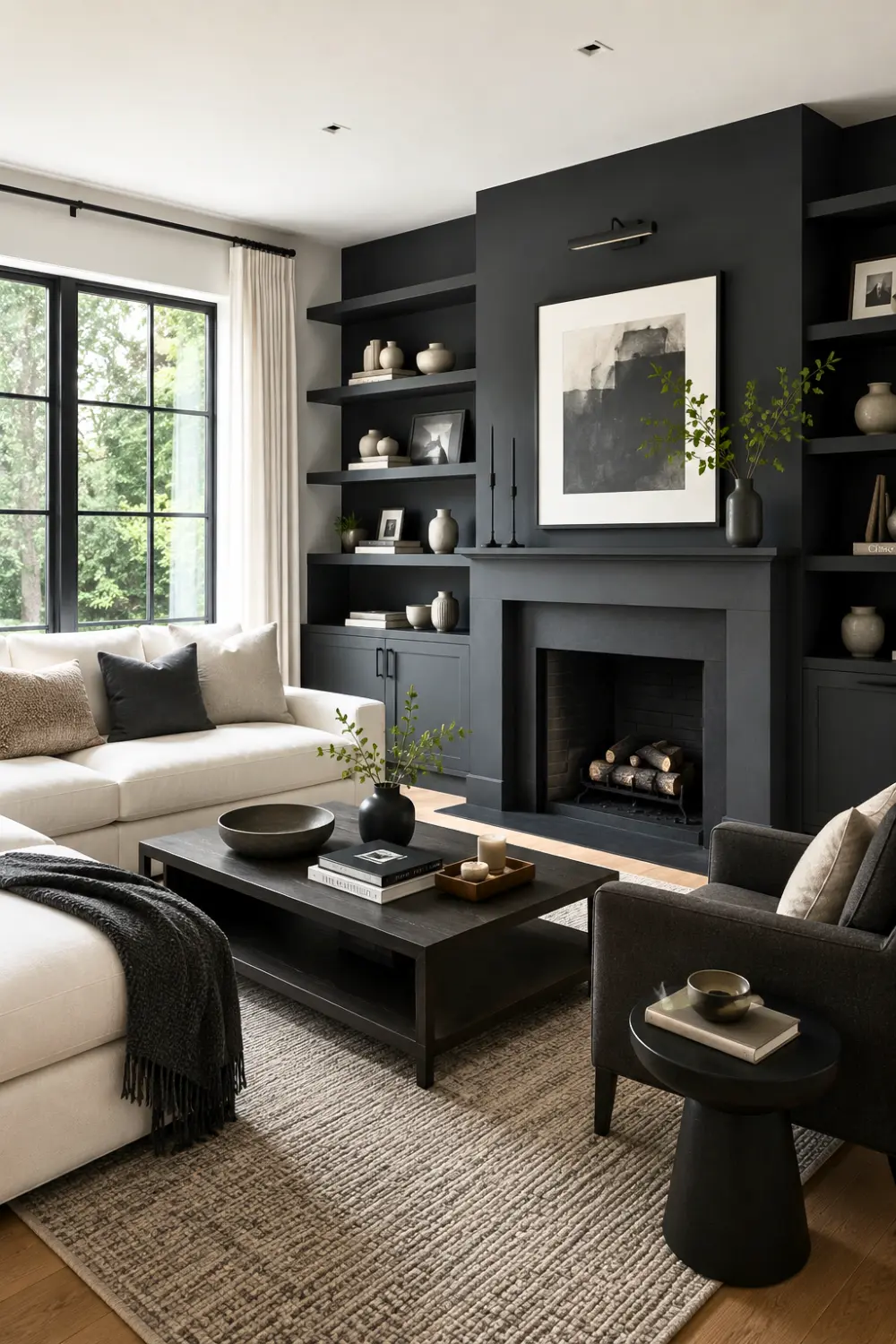
8. Charcoal & White
charcoal white living room color palette
Why This Palette Works
Charcoal adds deep, quiet strength — while white keeps the space open, and full of light. Together, they bring a bold, timeless elegance into the living room
This palette is for those who:
Love bold contrast with quiet elegance
Crave a clean, modern, minimal feel
Want a space that feels confident, calm
Appreciate timeless style over passing trends
Shop This Look
Add a charcoal linen sofa throw, crisp white ceramic table lamps, a black metal-framed wall mirror, and a graphic black-and-white area rug for bold, modern contrast.
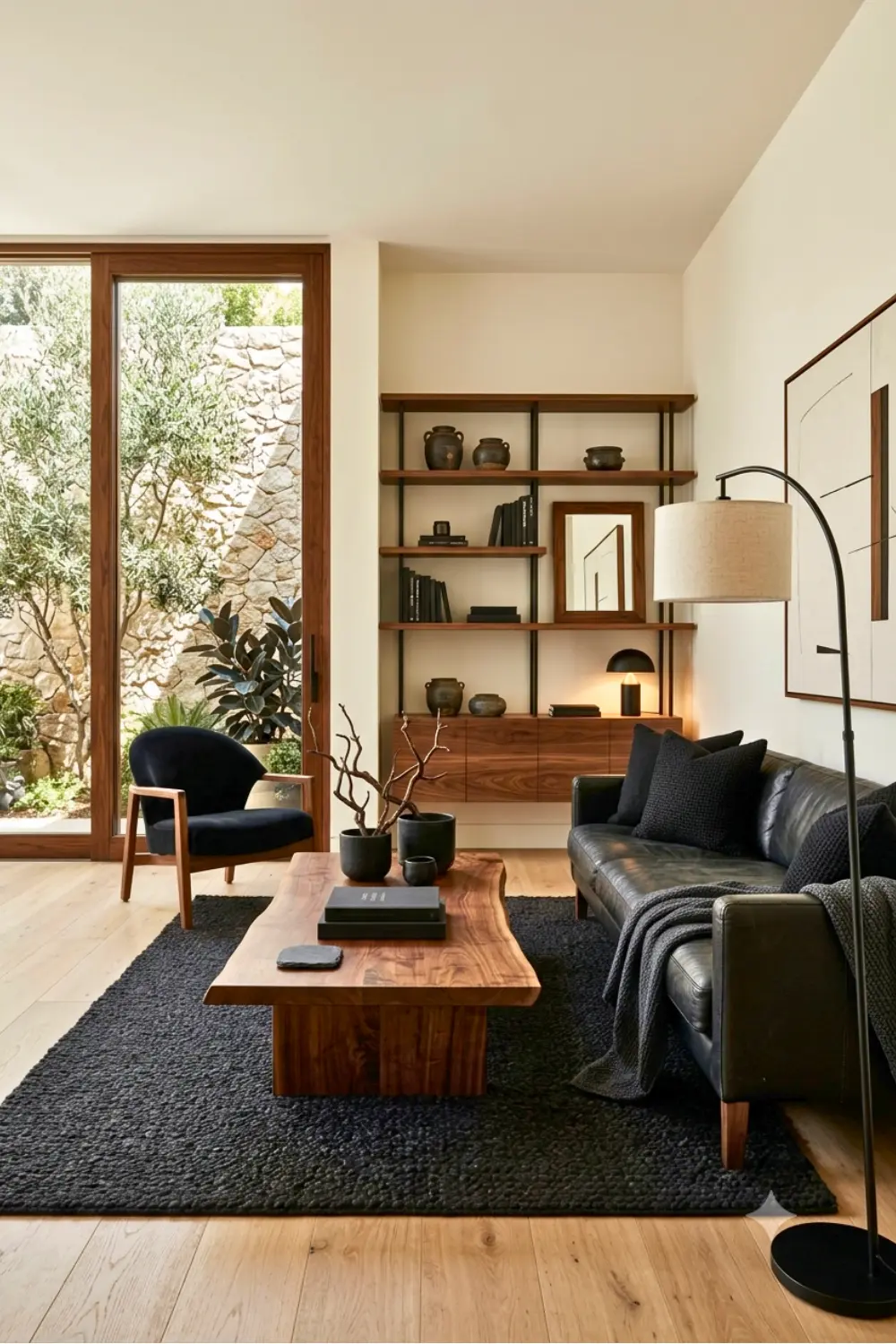
9. Black & Walnut
black walnut living room color palette
Why This Palette Works
This combination brings a rich, moody depth into the living room. Black adds drama and quiet intensity, like the hush right before a good conversation, while walnut’s deep, warm grain feels like it’s been passed down through generations, full of character and history. They make the space cozy and elegant.
This palette is for those who:
Love spaces with history and character
Crave drama, richness, and bold depth
Feel most at home surrounded by heritage
Want a room that feels bold
Shop This Look
Anchor the room with a solid walnut coffee table, black leather accent chair, brass reading lamp, and a deep charcoal wool throw blanket for a rich, storied feel.
Warm & Cozy Color Palettes
For a cozy living room color palette that feels like a warm hug, these earthy combinations are hard to beat.
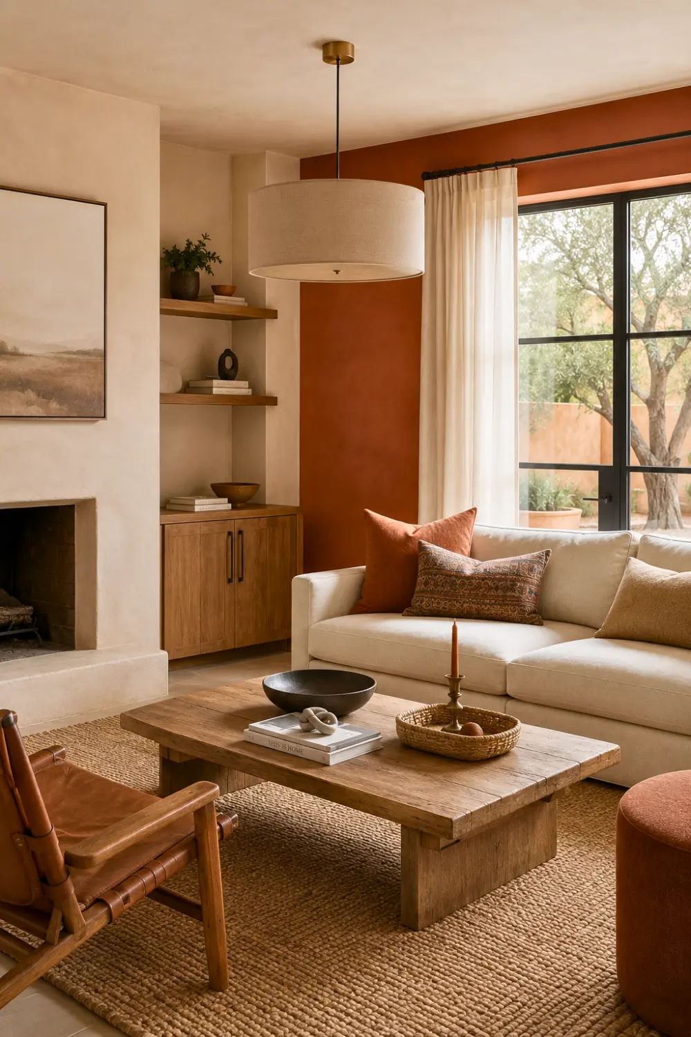
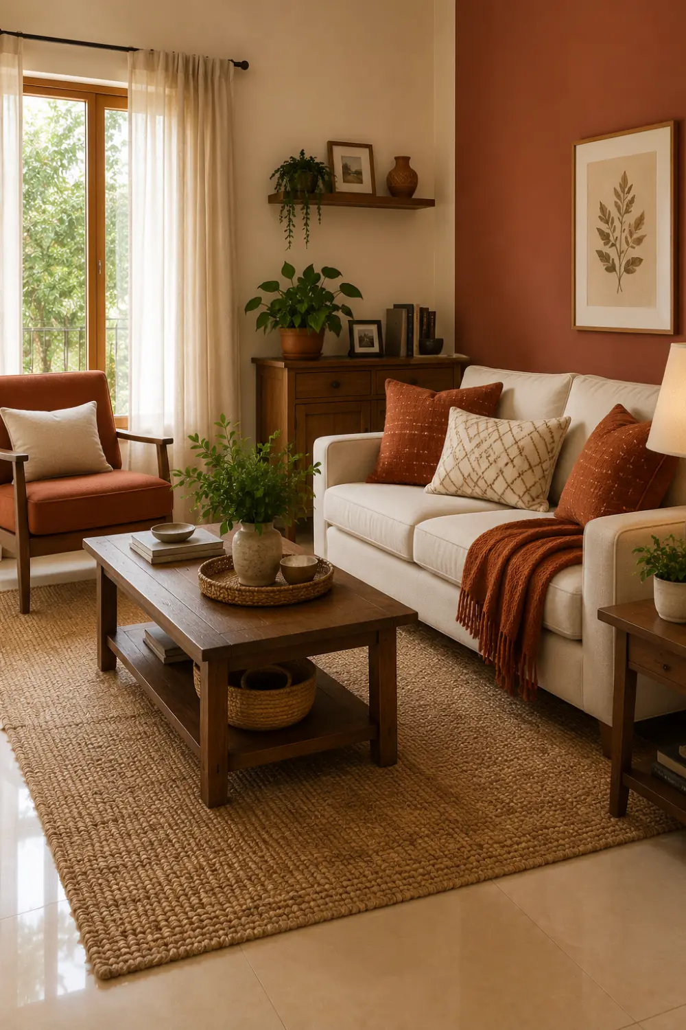
10. Terracotta & Beige
Terracotta & Beige living room color
Terracotta and beige bring the warmth of sun-baked earth into the living room. Terracotta feels rich and alive, like clay warmed by the afternoon sun, while beige keeps things soft and calm.
This palette is for those who:
Love warm, earthy tones
Crave a cozy, grounded living space
Feel joy in rustic, handcrafted charm
Want a home that feels effortlessly warm
Shop This Look
Warm up the space with a terracotta boucle throw pillow set, a handmade clay vase, a beige woven pouf, and a rattan wall mirror for rustic, sun-baked charm.
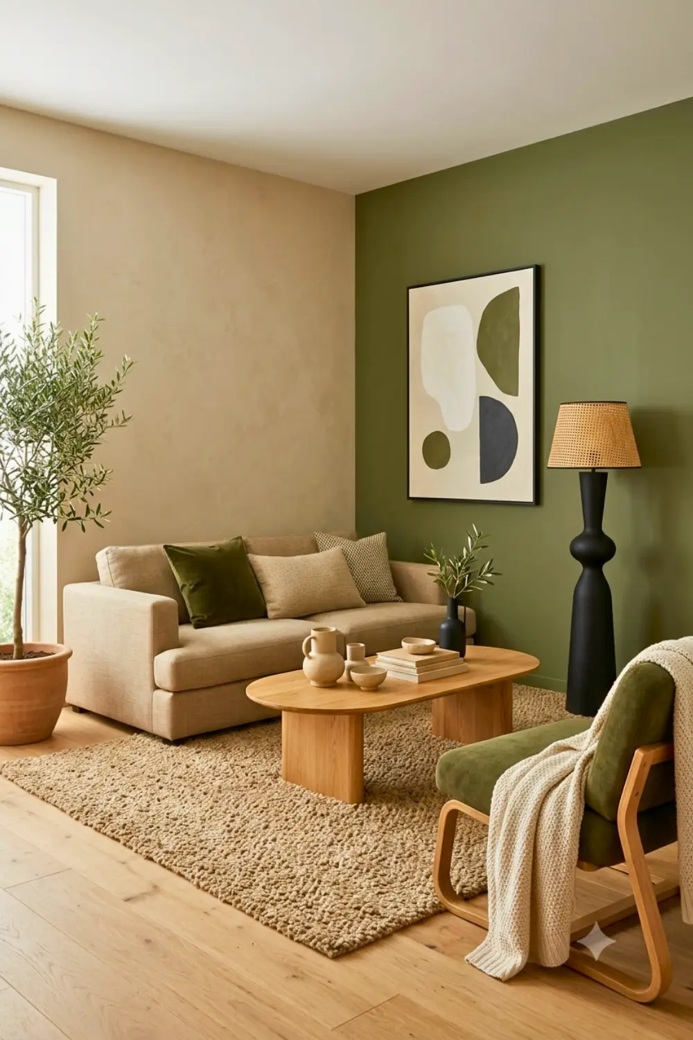
11. Olive Green & Sand
olive green sand living room color palette
Olive green and sand bring the feel of a quiet countryside retreat into the living room. Olive carries a deep, natural richness — like leaves that have soaked up a whole summer, while sand keeps the space soft, warm, and grounded. Together, they feel steady and unpretentious.
This palette is for those who:
Love earthy, understated, nature-inspired charm
Crave a calm, grounded living space
Feel drawn to countryside, rustic simplicity
Want a home that feels honest, unrushed
Shop This Look
Complete the countryside feel with an olive green linen sofa throw, a set of sand-toned ceramic planters, a woven wall hanging, and a natural wood side table.
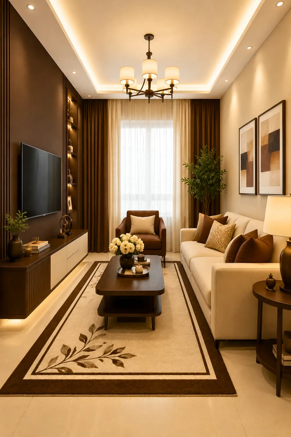
12. Chocolate Brown & Cream
chocolate brown cream living room color palette
Chocolate brown and cream bring a warm, indulgent elegance into the living room. Chocolate brown adds rich, comforting depth, grounding the space with a sense of stability and warmth, while cream lightens things up, keeping the room airy and inviting rather than heavy. Together, they create a space that feels luxurious.
This palette is for those who:
Love rich, warm, indulgent color tones
Crave comfort with a touch of luxury
Want a cozy yet elegant living space
Feel at home in warm, timeless interiors
Shop This Look
Layer in a chocolate brown bouclé accent chair, cream throw pillow covers, a warm brass floor lamp, and a plush cream area rug for indulgent, cozy elegance.
13. Rust & Ivory
rust ivory living room color palette
Rust and ivory bring a warm, sunset glow into the living room — like the last light of an autumn evening settling softly into the space. Rust adds bold, earthy warmth and character, while ivory softens the look, keeping the room bright, calm, and relaxed.
This palette is for those who:
Love warm, bold, sunset-inspired hues
Crave character with a soft touch
Feel drawn to autumn-inspired, earthy interiors
Want a space that feels warm, alive
Shop This Look
Style the space with a rust velvet throw pillow set, ivory linen curtains, a ribbed ceramic table lamp, and a warm wood-framed accent mirror for sunset-inspired charm.
Bold & Elegant Color Palettes
If you want a bold living room color palette that makes a statement, these rich, elegant combinations deliver.
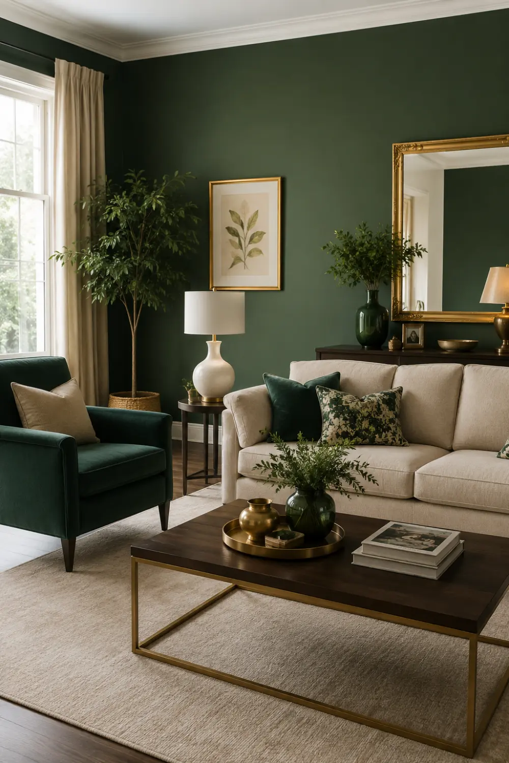
14. Emerald Green & Gold
emerald green gold living room color palette
Emerald green and gold bring a touch of quiet luxury into the living room. They create a room that feels glamorous without losing its warmth — a space made for both quiet evenings and special gatherings, where every detail feels intentional and cherished.
This palette is for those who:
Adore rich, jewel-toned, luxurious interiors
Love a touch of glamour, elegance
Feel joy in bold, statement-making spaces
Want a home that feels special, celebrated
Shop This Look
Add a touch of glamour with an emerald green velvet sofa throw, gold-finished table lamps, a brass and glass coffee table, and gold-rimmed decorative trays.
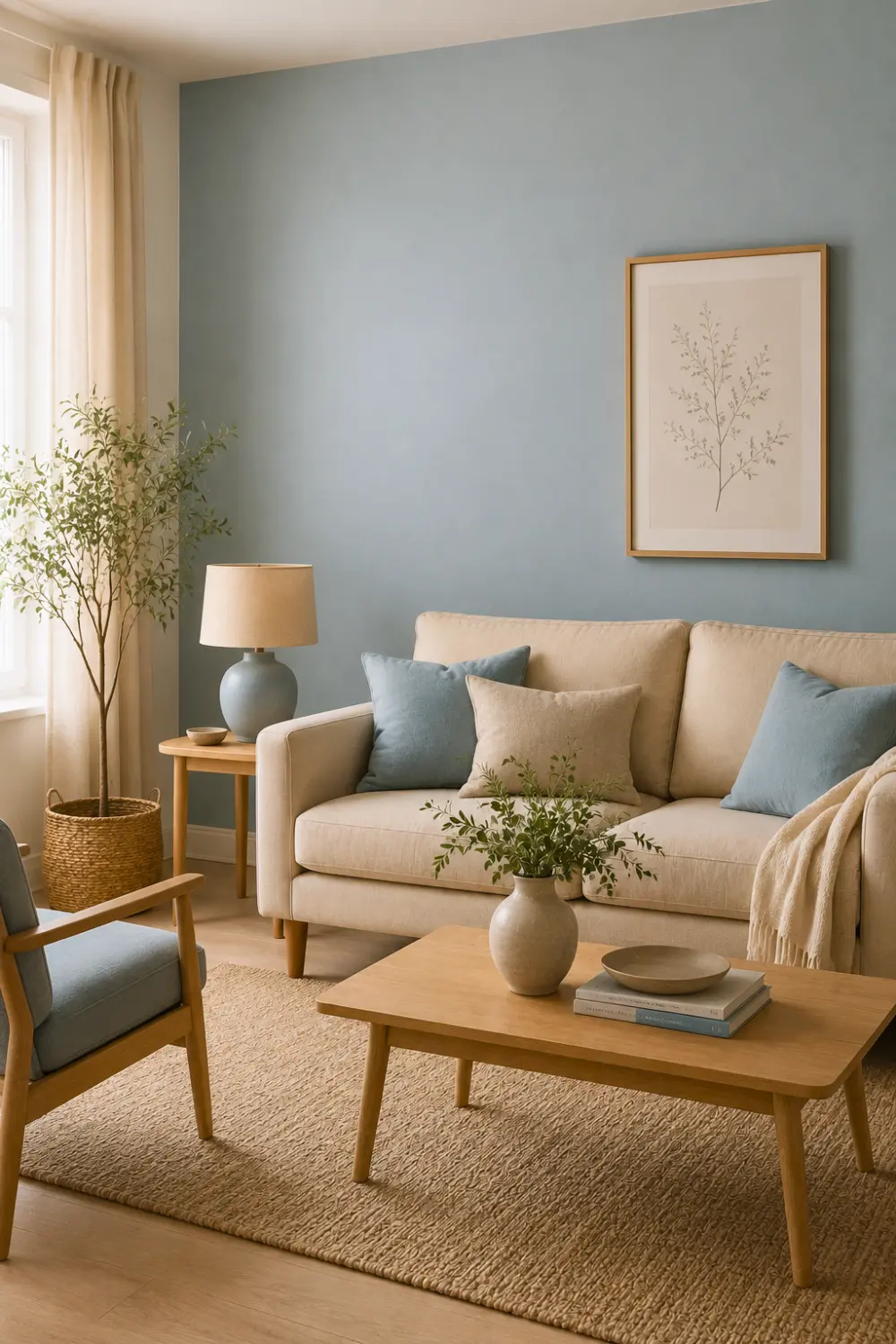
15. Dusty Blue & Beige
dusty blue beige living room color palette
Dusty blue and beige bring a soft, breezy calm into the living room — like an overcast sky meeting warm sand along a quiet shore. Dusty blue feels muted and soothing, easing the mind the moment you walk in, while beige adds a gentle warmth that keeps the space feeling grounded and welcoming.
This palette is for those who:
Love soft, muted, calming color tones
Crave a peaceful, breezy living space
Feel most relaxed in gentle interiors
Want a home that feels serene, unhurried
Shop This Look
Bring in a dusty blue linen sofa slipcover, beige woven throw pillows, a soft jute area rug, and a set of ceramic table lamps for a calm, breezy finish.
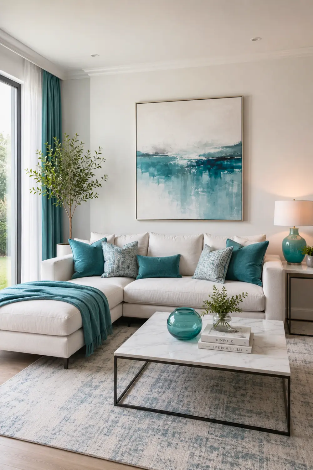
16. Teal & White
teal white modern living room color palette
Teal and white bring a fresh, vibrant energy into the living room. Teal adds a bold, lively depth, full of personality and charm, while white keeps the space crisp, open, and airy, letting the color truly shine. Together, they create a bright and refreshing room.
This palette is for those who:
Love bold color with a fresh feel
Crave vibrant, uplifting living spaces
Feel drawn to ocean inspired, lively tones
Want a home that feels bright, cheerful
Shop This Look
Add energy with a teal velvet accent chair, crisp white throw pillow covers, a woven white area rug, and a set of glass vases for a fresh, ocean-inspired finish.
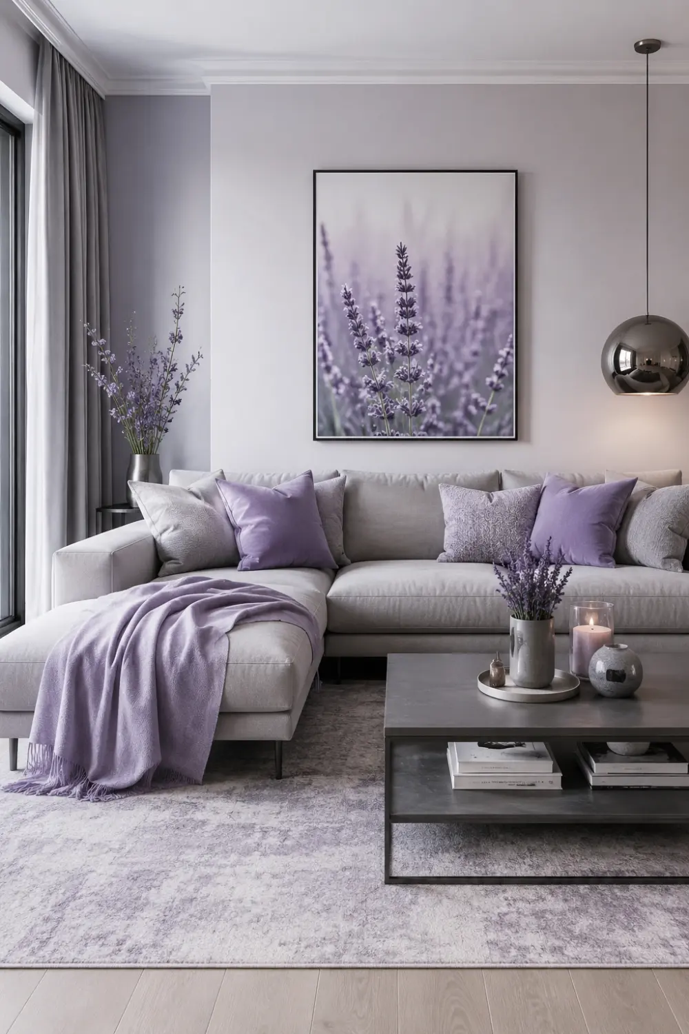
17. Lavender & Gray
lavender gray living room color palette
Lavender and gray bring a gentle, dreamy softness into the living room. Lavender adds a delicate, soothing touch, while gray keeps the space balanced and calm, letting the softer tone feel graceful rather than overpowering.
This palette is for those who:
Love soft, dreamy color tones
Crave a calm, gentle living space
Feel most at ease in soothing interiors
Want a home that feels peaceful
Shop This Look
Complete the dreamy look with a lavender bouclé throw pillow set, a soft gray knit blanket, a fluted ceramic table lamp, and a delicate glass vase for gentle romance.
Designer Tips for Choosing Living Room Colors
Choosing the right living room color scheme can feel overwhelming — but with a few designer secrets, it becomes a lot more intuitive (and fun!). Here are some simple, tried-and-true tips to help you create a space that truly feels like you.
1. Follow the 60-30-10 Rule
This classic rule takes the guesswork out of any living room color combination. Use 60% as your dominant color (walls, large furniture), 30% as a secondary color (curtains, accent chairs), and 10% as a pop of accent color (cushions, decor). It creates balance without feeling chaotic — like your room is telling one cohesive story.
2. Always Test Paint Samples First
Colors shift with lighting — what looks warm and cozy in the store might feel completely different in your living room at sunset. Paint small swatches on your wall and observe them morning, noon, and night before committing. A little patience here saves a lot of heartache later. This step is important if you’re comparing the best living room paint colors before making a final decision.
3. Pay Attention to Undertones
Every color has a hidden undertone — warm, cool, or neutral — and it can make or break your living room color theme. A “white” with blue undertones can feel cold, while one with yellow undertones feels warmer and more inviting. Trust your eyes, but also test in natural light.
4. Balance Warm and Cool Tones
The most inviting rooms often mix warmth and coolness — like pairing a warm wood tone with a cool gray, or rust with dusty blue. This balance keeps a space feeling alive rather than one-note, adding depth and emotional warmth to any color palette ideas for living room.
At the end of the day, the “right” colors are the ones that make you feel calm and happy.
Frequently Asked Questions
What is the best color for a living room?
There’s no single “best” color — it depends on the mood you want to create. Neutral tones like beige, taupe, and warm white are timeless and easy to live with, while bolder shades like emerald or navy add personality. The best living room color scheme is simply the one that makes you feel calm and happy when you walk in.
Which colors make a living room look bigger?
Light, soft shades like ivory, white, and pale gray naturally open up a space by reflecting light. Keeping walls and larger furniture in similar light tones also helps the room feel more spacious and airy. These small living room color ideas work especially well in compact spaces.
What is the 60-30-10 color rule?
It’s a simple designer trick for balanced spaces: 60% dominant color, 30% secondary color, and 10% accent color. This ratio helps any living room color combination feel intentional rather than random.
Are gray living rooms still in style?
Yes — gray remains a beloved neutral, especially when warmed up with wood tones, beige, or soft blues. Today’s gray living rooms feel cozier and more layered than the cooler, flat grays of a few years ago.
How many colors should a living room have?
A good rule of thumb is 3 to 4 colors — a dominant shade, a secondary tone, and one or two accents. This keeps your living room color theme cohesive without feeling overwhelming.
Should walls be lighter than furniture?
Not always, but it’s a safe, classic approach — lighter walls with deeper furniture tones create balance and depth. That said, moody walls with lighter furniture can feel just as beautiful; it really comes down to the emotional tone you’re going for in your color palette ideas for living room.
Conclusion
At the end of the day, your living room should feel like you, a space that welcomes you in and makes you want to stay a little longer. Whether you’re drawn to the calming softness of sage and cream, the timeless elegance of charcoal and white, or the cozy warmth of chocolate brown, the right living room color scheme is one that reflects your personality and fits naturally into your space.
Don’t be afraid to experiment with different living room color combinations, test your undertones, and trust your instincts. There’s no one “correct” living room color theme — only the one that makes your heart feel a little lighter every time you walk through the door.
So take your time, have fun with it, and let your space tell your story, one beautiful color at a time.